Before and after
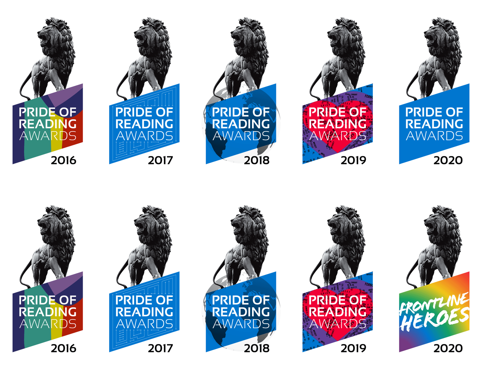
The previous Pride of Reading Awards logo alongside our redesign.
Client
Pride of Reading
Deliverables
Brand identity
Logo design
Literature
Marketing collateral
Architectural graphics
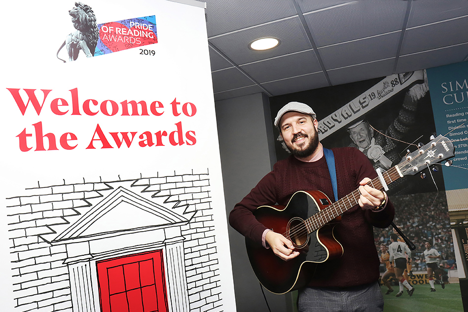
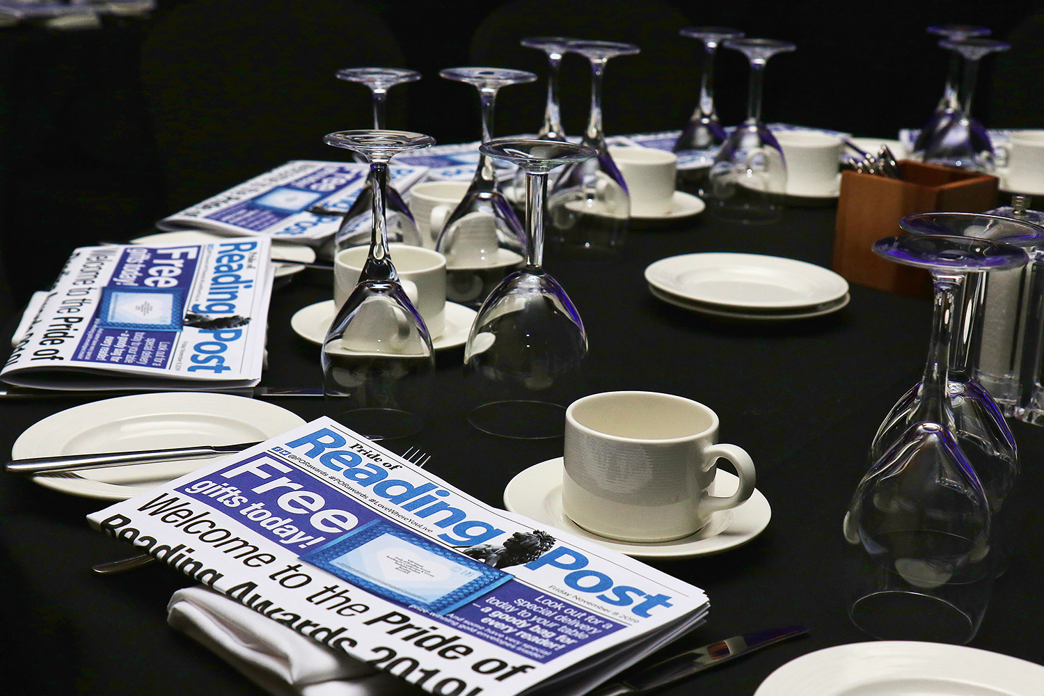
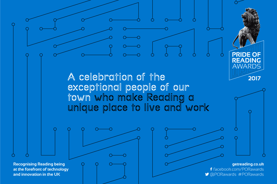
The Pride of Reading Awards has grown into a hugely prestigious and, quite frankly, humbling event. It’s a celebration of the exceptional people of our town who make Reading a unique place to live and work. We’ve been on board since 2010, as part of the production team, creating branding and collateral worthy of the occasion.

The previous Pride of Reading Awards logo alongside our redesign.
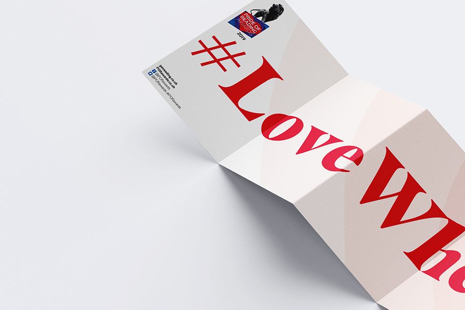
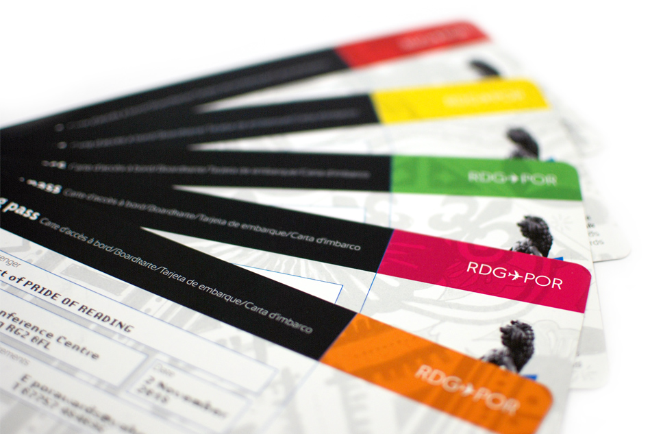
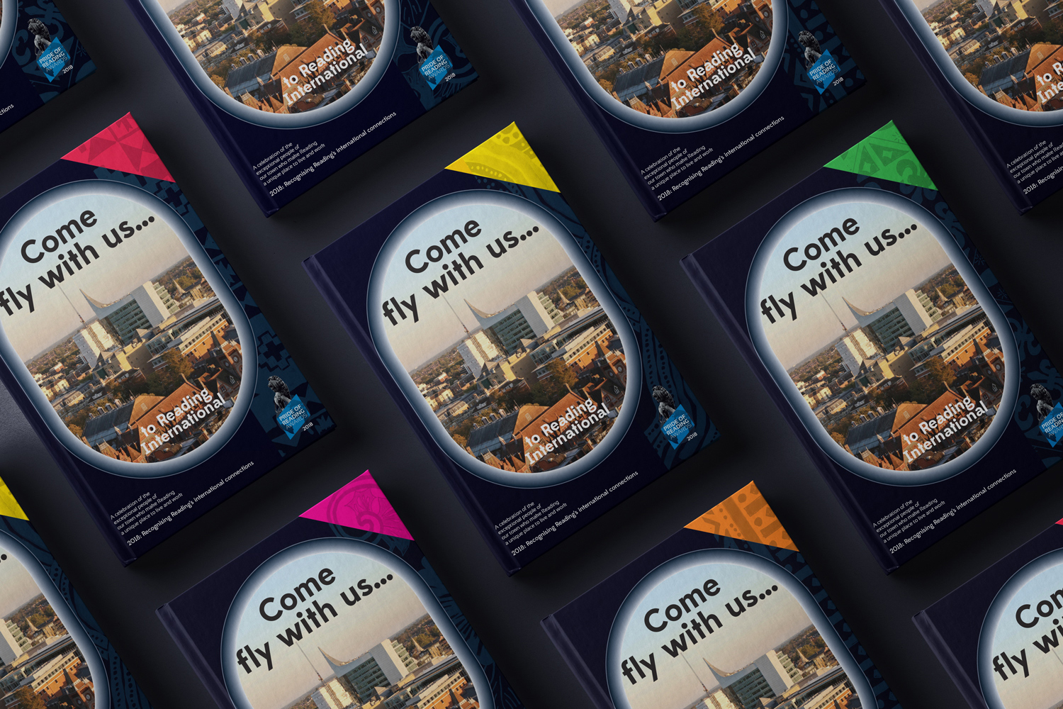
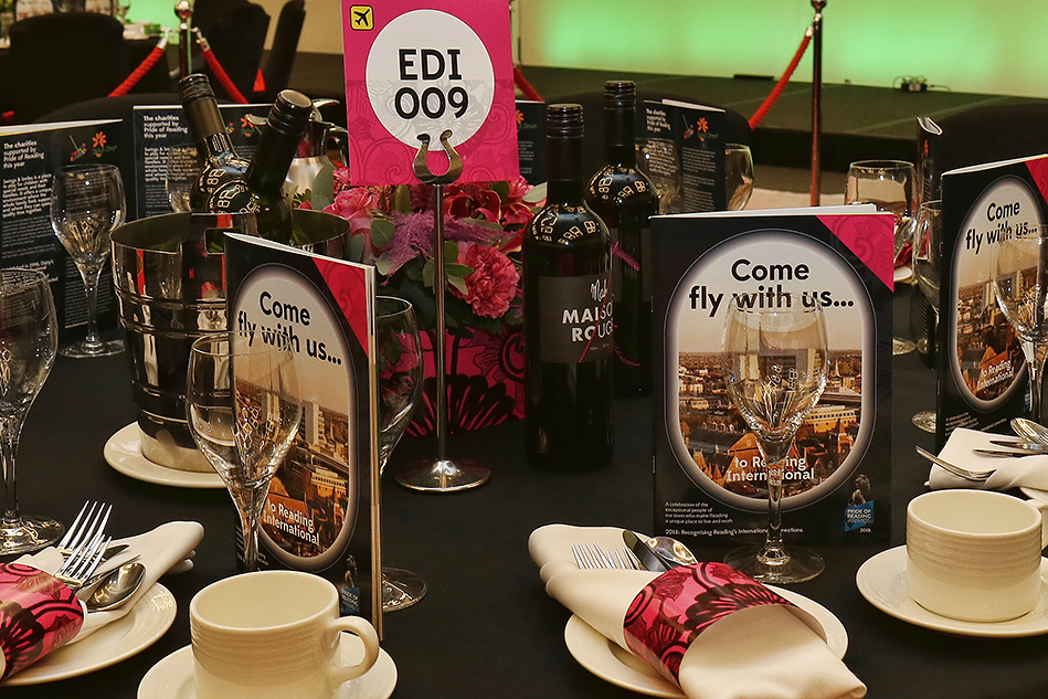
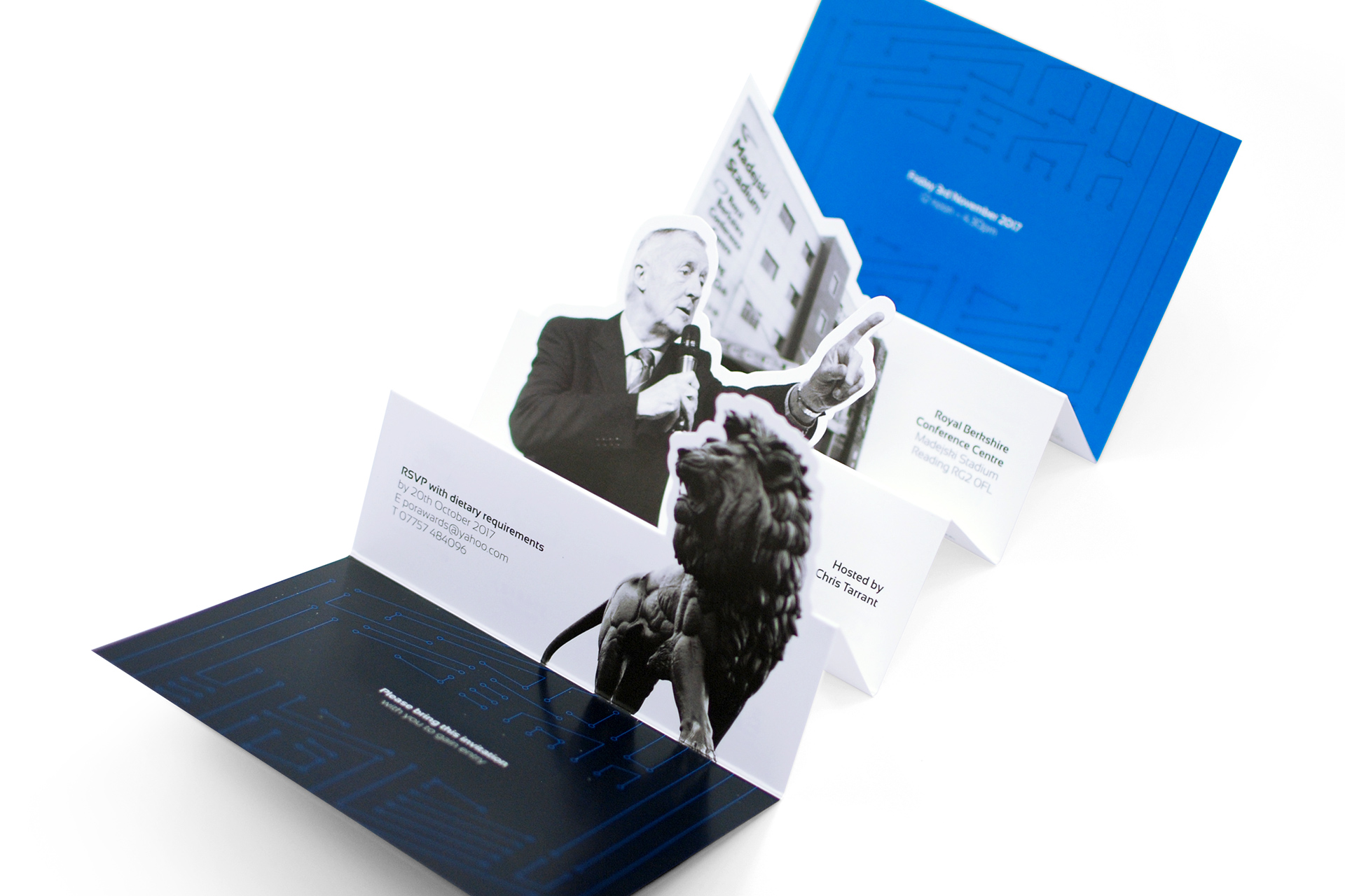
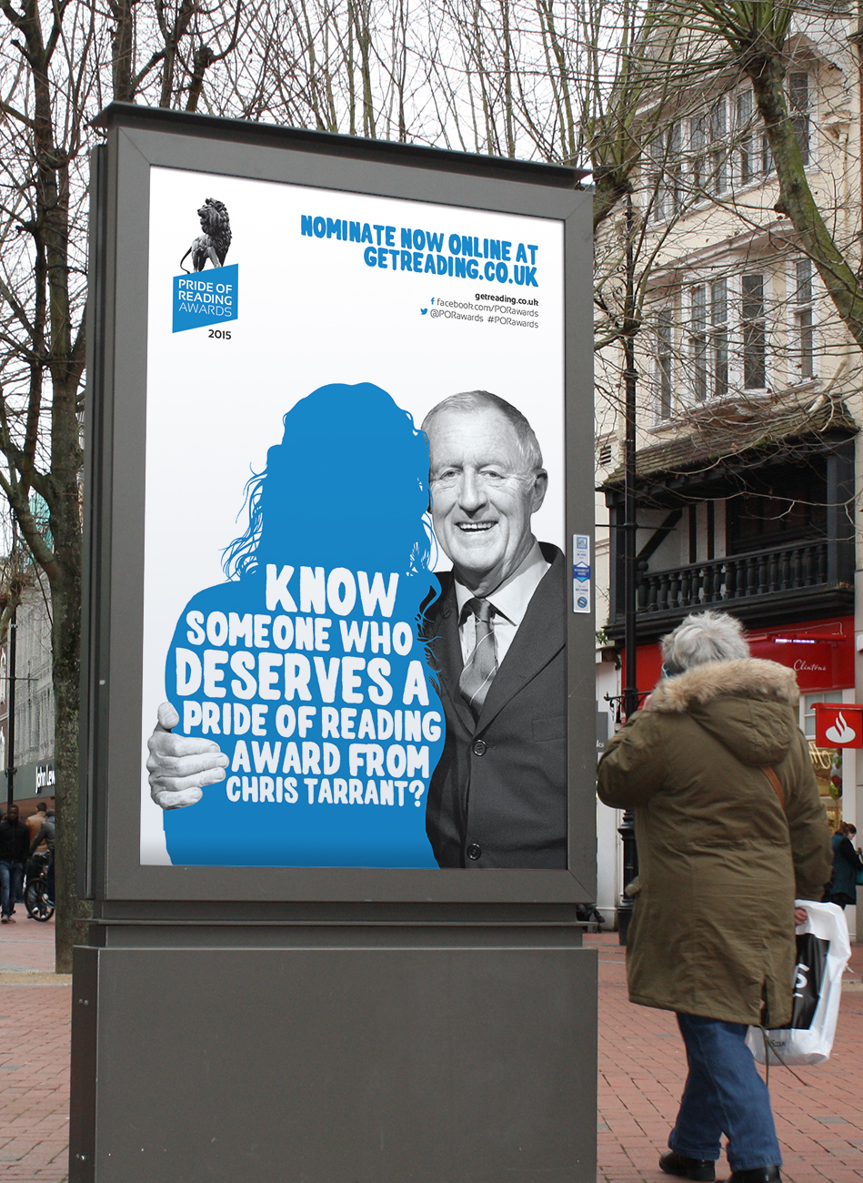
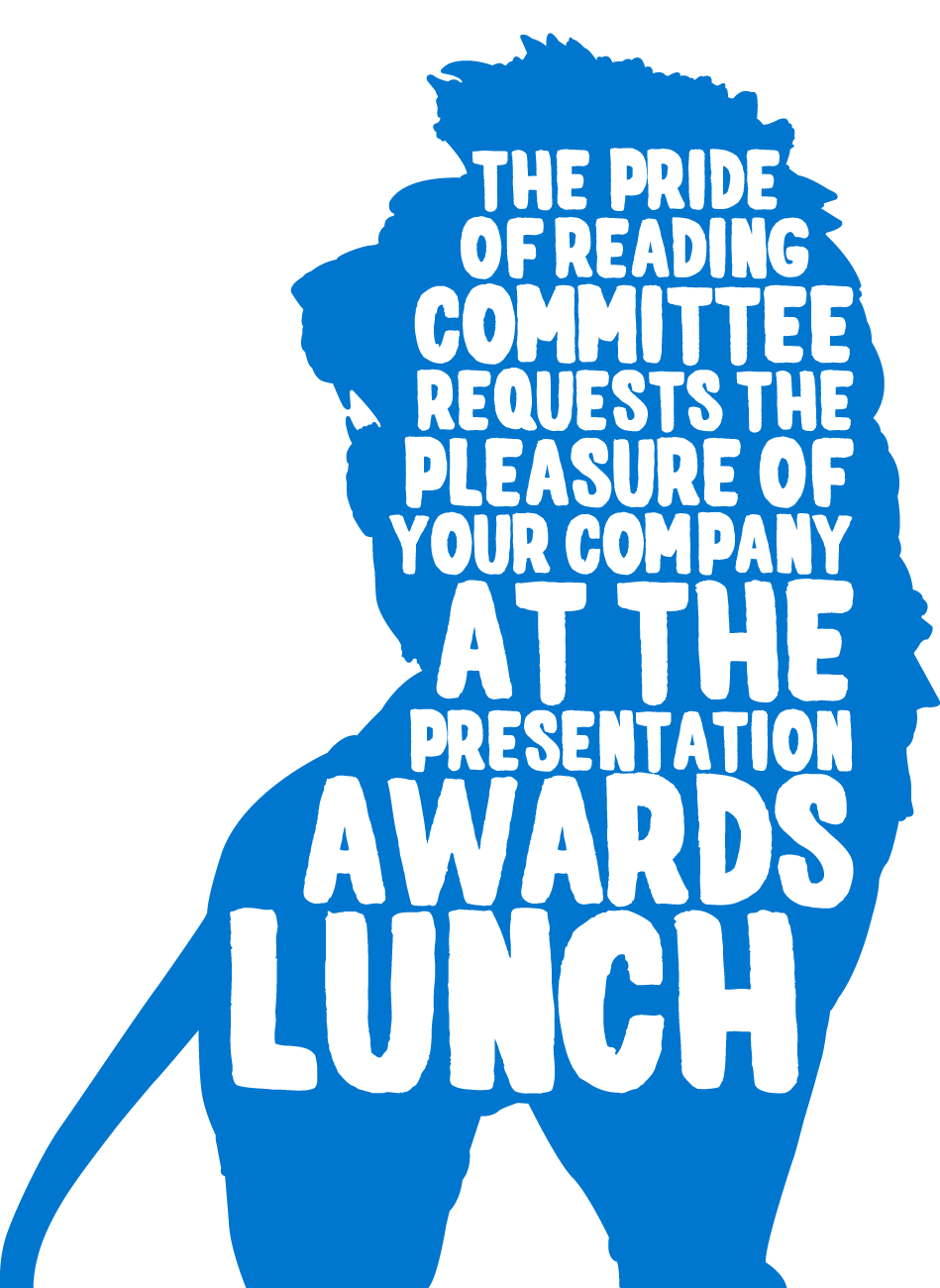
Our work has grown in tandem with the Awards. From simple invitations, menus and banners for the first few years, albeit with new imagery and a refined palette, in 2014 we created a new brand look and feel. Paying homage to both the historical Maiwand Lion sculpture and the war memorial it bestrides, we’ve latterly been referencing each year’s theme within the brand mark.
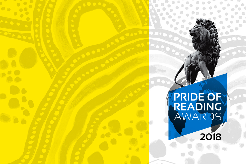
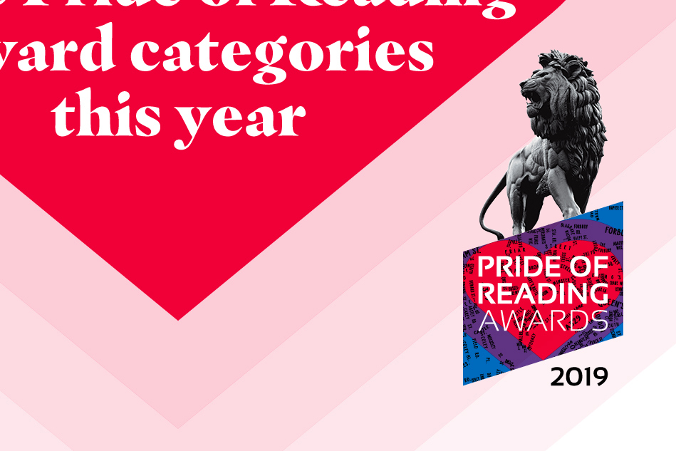
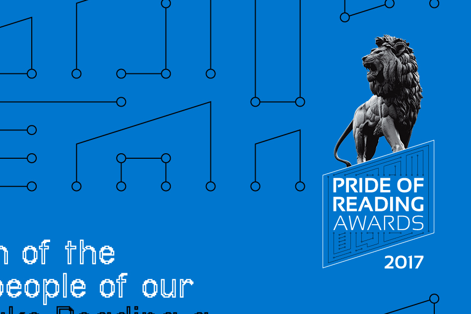
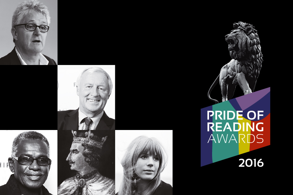
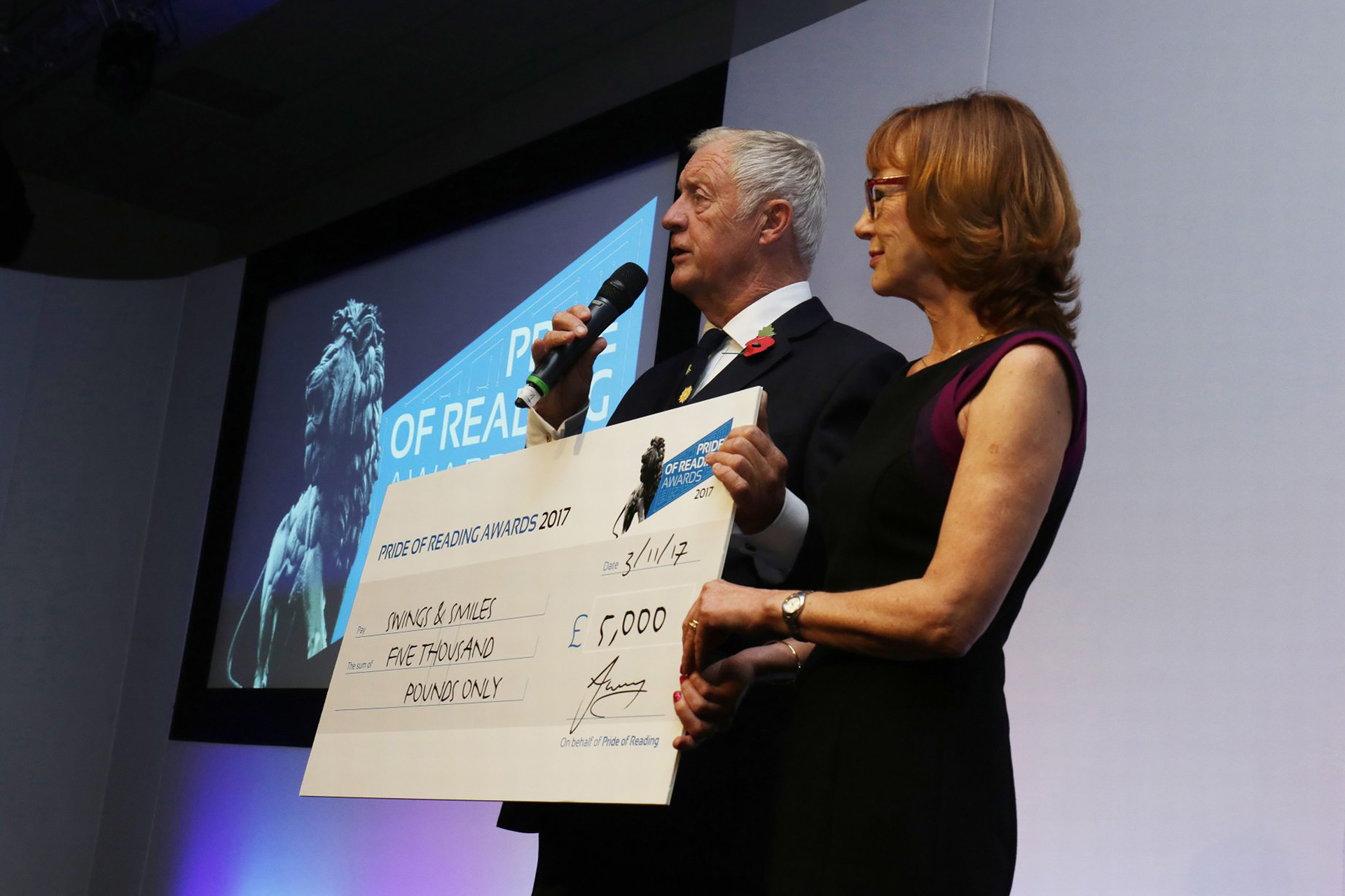
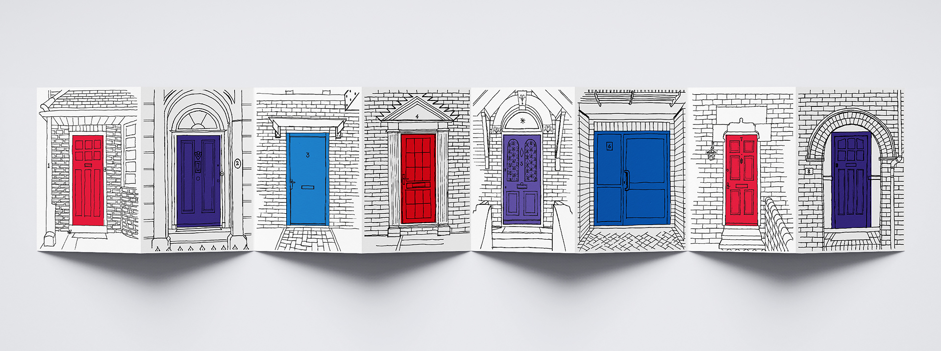
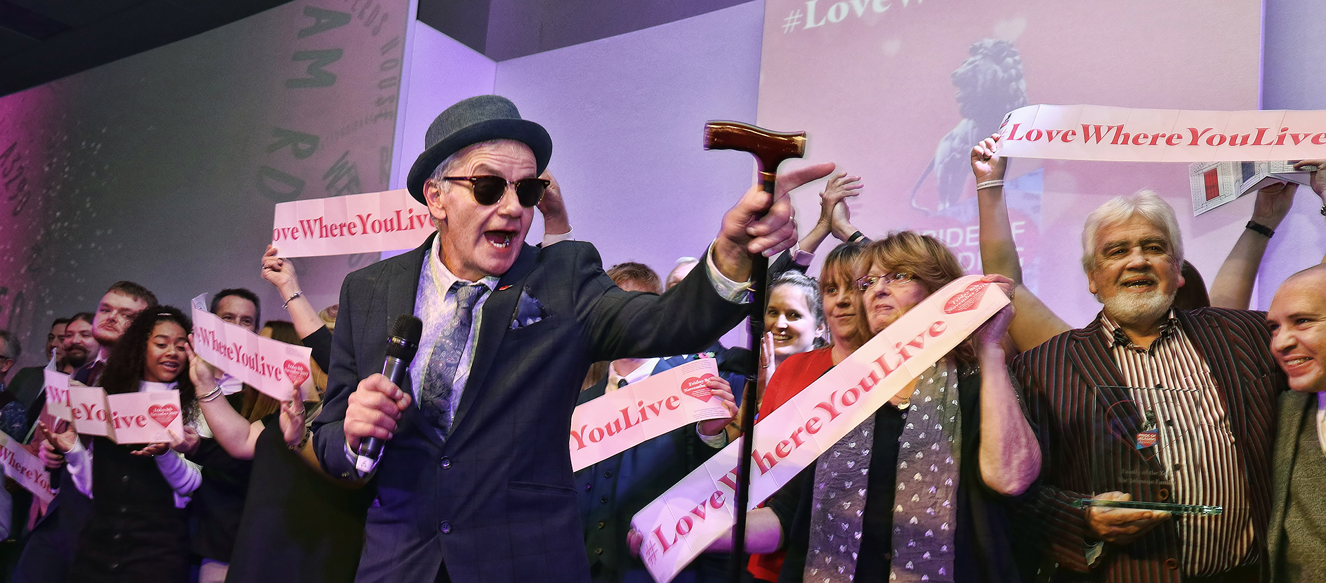
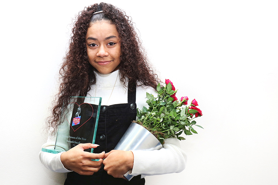
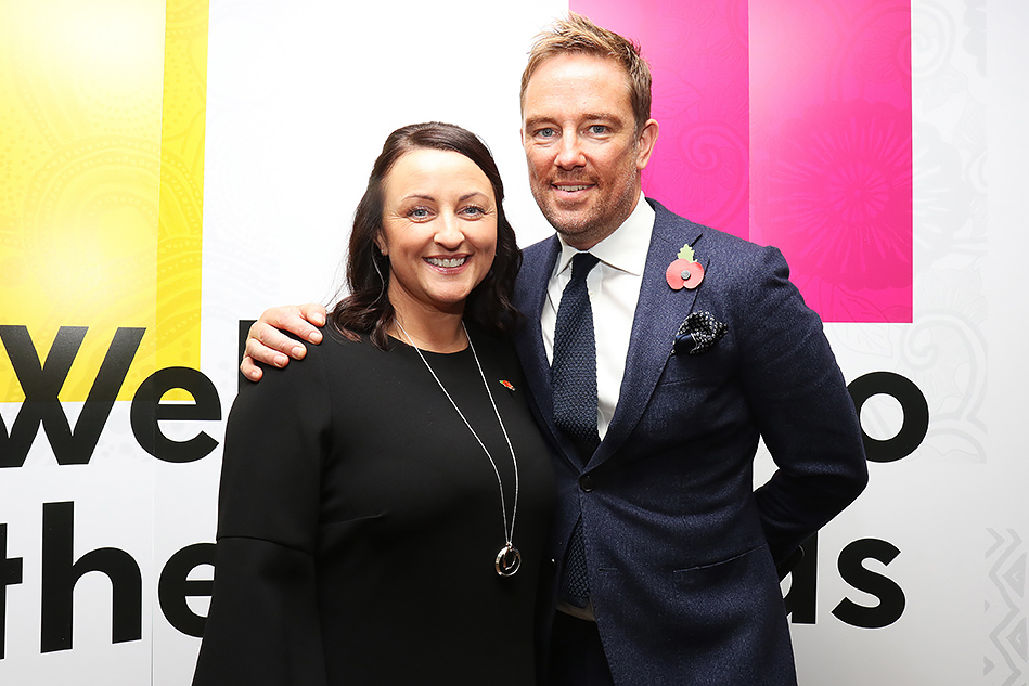
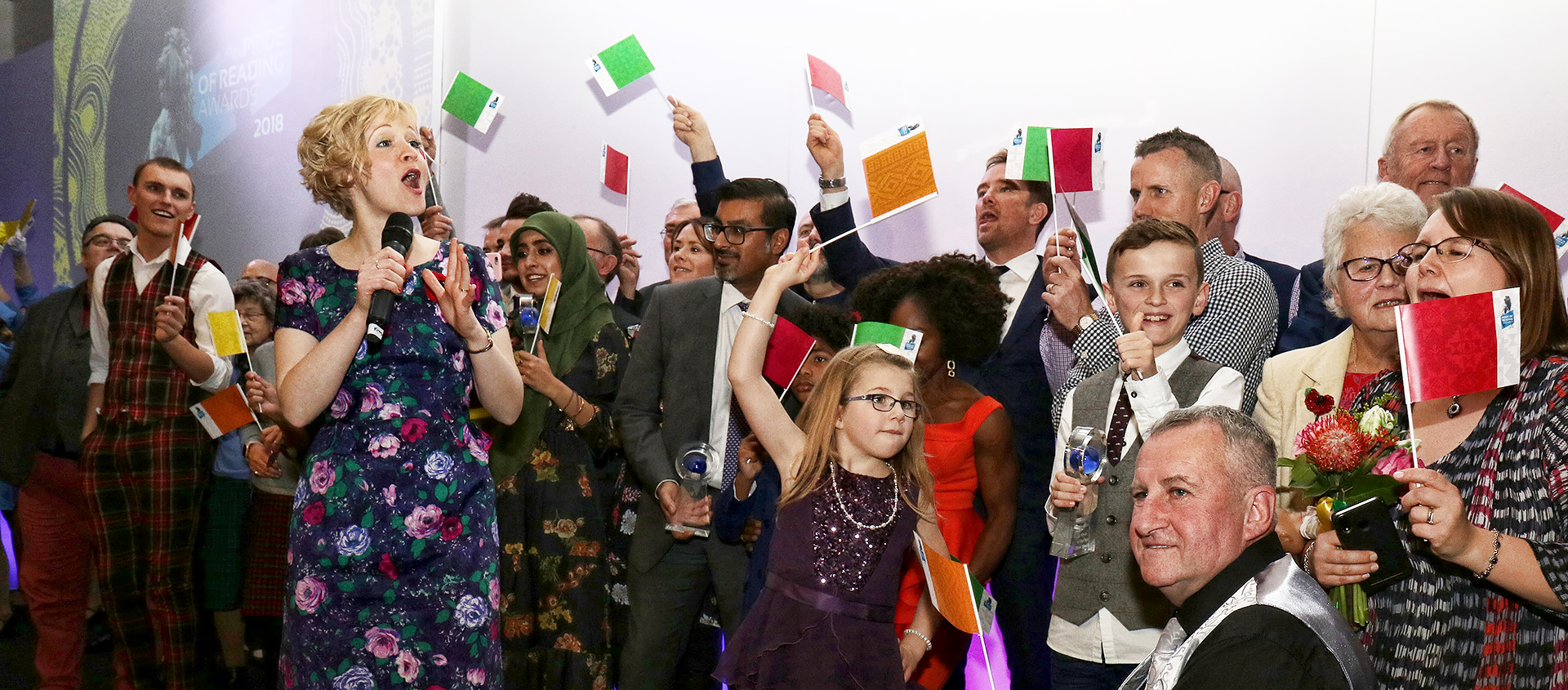
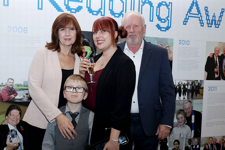
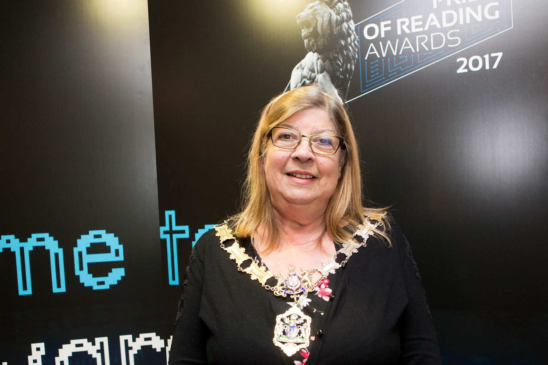
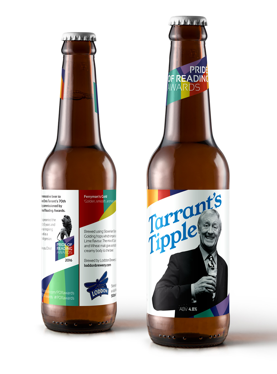
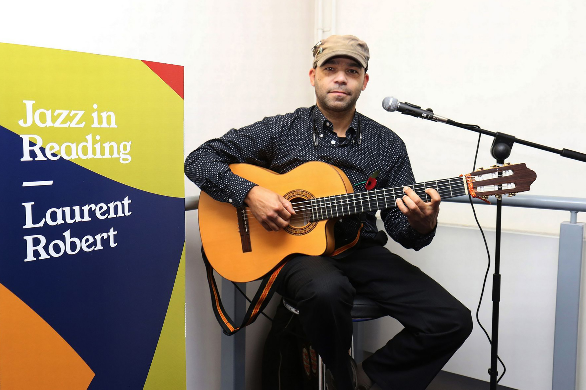
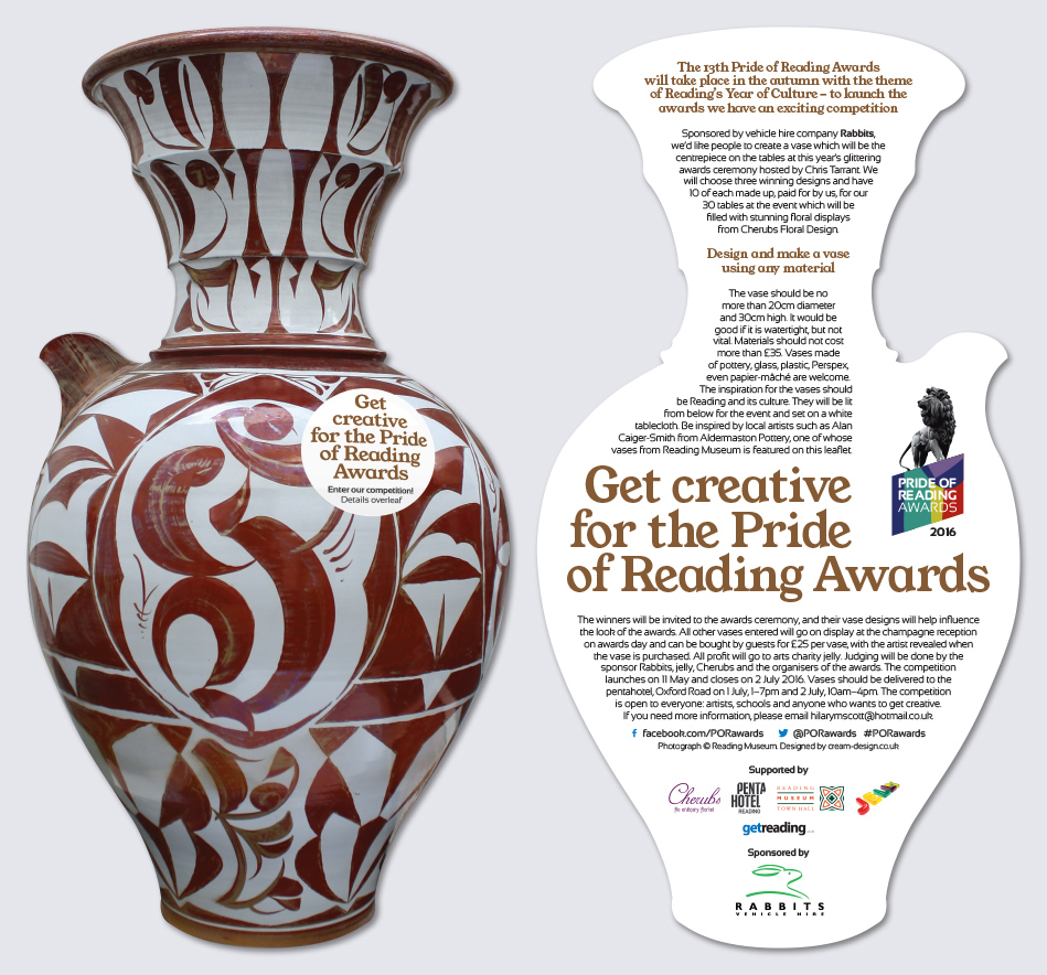
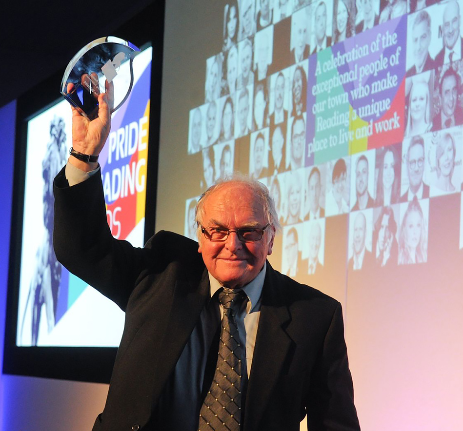
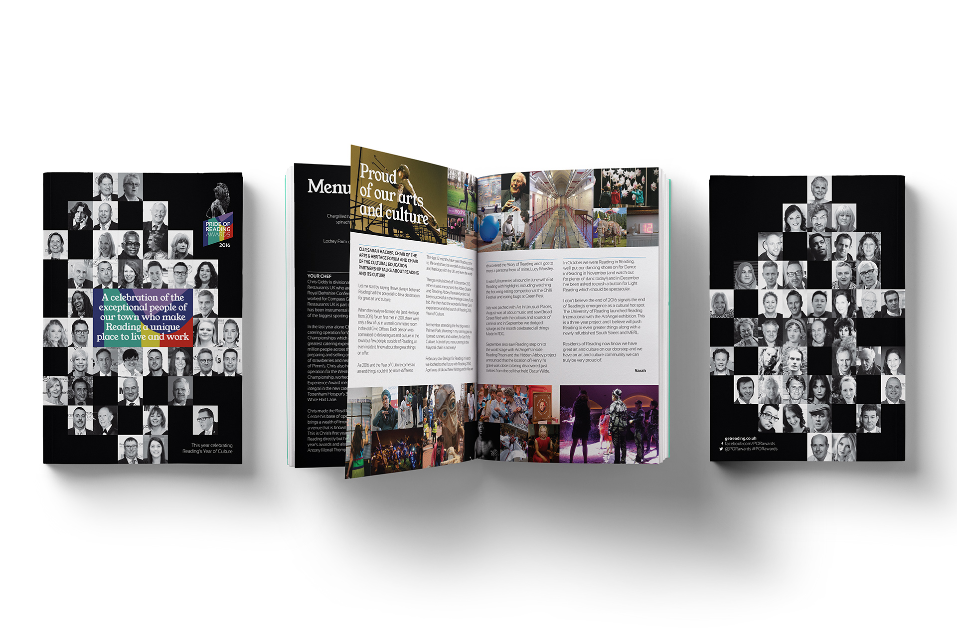
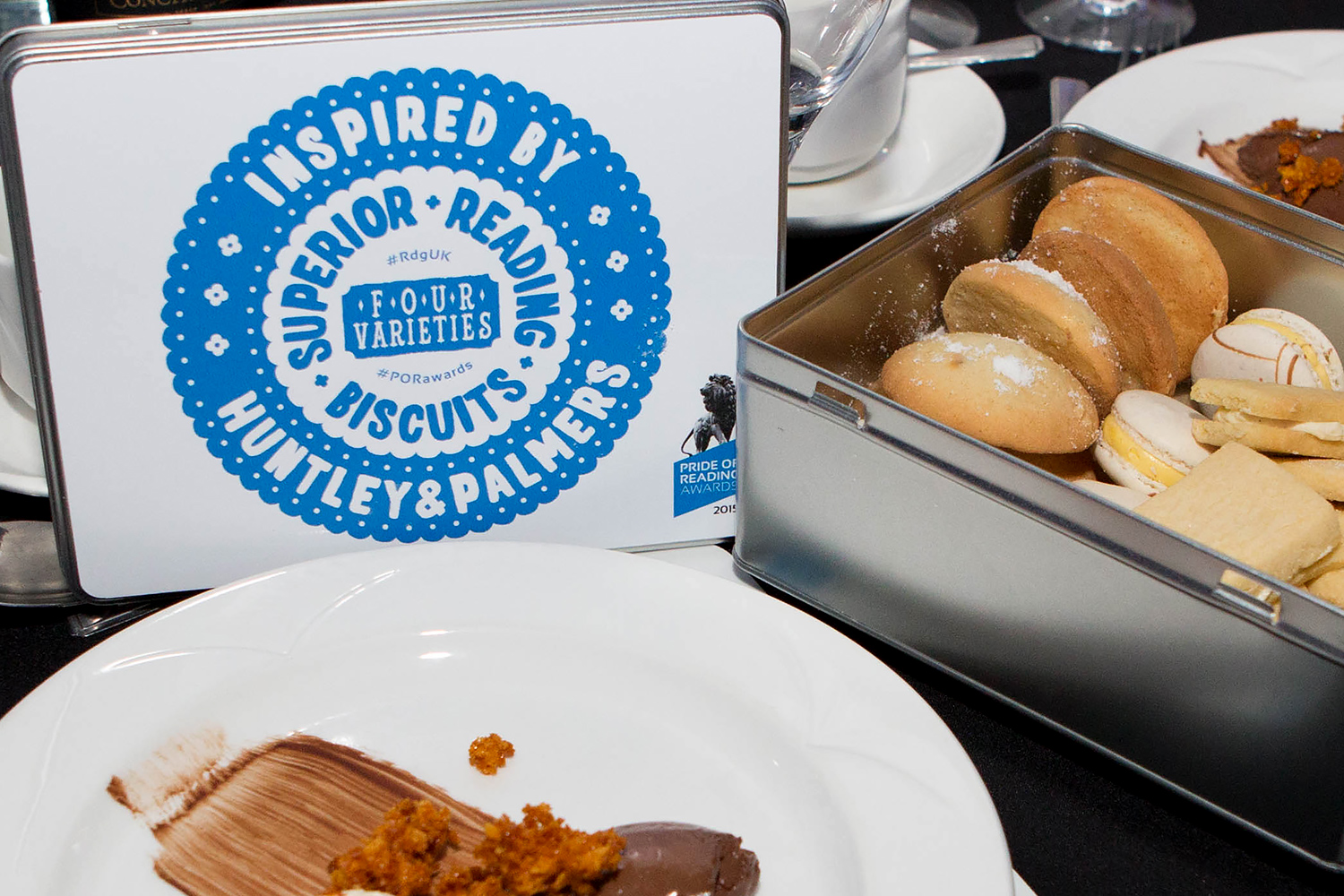
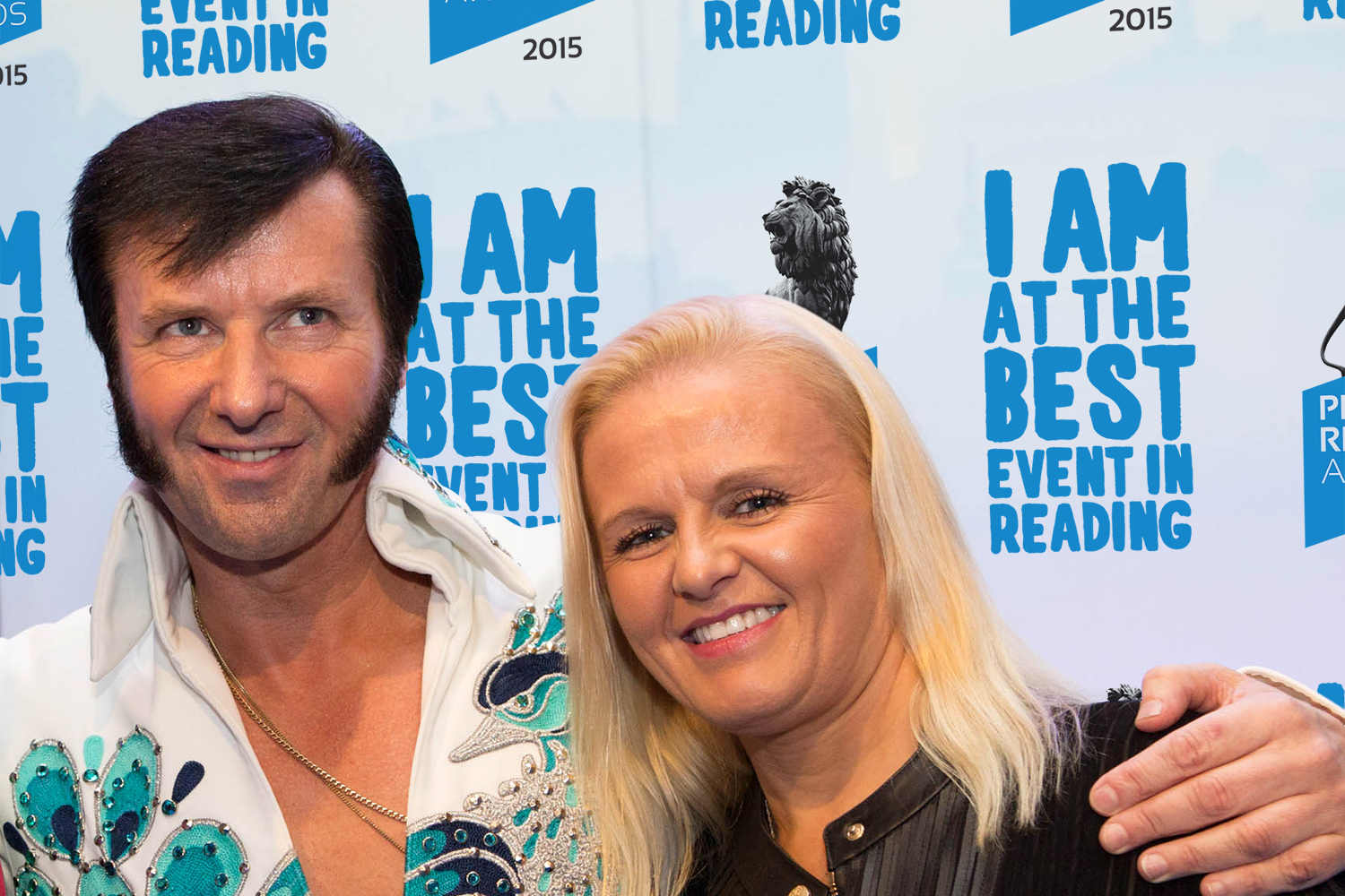
A hero typeface is introduced each year to work alongside the brand font and colour palette. Innovative print and finishes are used across the awards invitation and collateral. Large-format banners, screens and backdrops promote the all-important award sponsors, and bring colour and personality to the event. Thanks to Dijana Capan for the awards photography shown here.


‘We’ve been working in partnership for ten years with Cream Design. Year on year their design concepts for the Pride of Reading Awards have taken our brand to new heights. They are a joy to work with, professional in their approach, delivering high quality work within deadlines. We receive compliments each year on the design of all aspects of the Awards from the launch event to the Awards Lunch, probably the ‘biggest party in town’. Thank you Cream Design for working with us to create this amazing event.’
Sally Swift, Pride of Reading Chair