Before and after
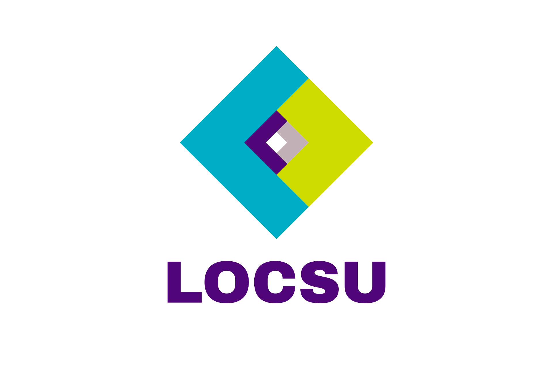
The previous LOCSU logo alongside our redesign.

Client
LOCSU
Deliverables
Brand identity
Logo design
Website design and build
Photography
Social media
LOCSU support over 70 Local Optical Committees (LOCs) across England offering expertise in regulation and policy. They came to us looking to revamp their brand and redesign their website.

The previous LOCSU logo alongside our redesign.

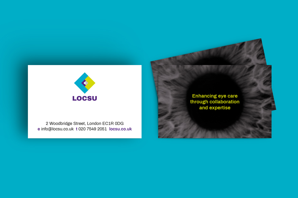
The new LOCSU logo is composed of four arrows to indicate the guidance the organisation gives to LOCs through a complex and dynamic industry. The icon conveys the subtle suggestion of an eye without going down the well-trodden paths which cropped up at our research stage.


As well as showcasing the new brand’s personality, the LOCSU website design needed to accommodate a considerable number of resources which could be easily found. Incorporating a searchable service directory was a key technical consideration.


55.2%
average newsletter open rate (38.6% industry average)


‘We have received positive feedback across the board about the new branding and website. The new branding gives us a more progressive and up to date feel, and users have found the new website much easier to navigate to find the information they need.’
Richard Whittington, Chief Executive Officer