Before and after
The previous Jacobs logo alongside our evolved branding.

Client
Jacobs
Deliverables
Brand identity
Brand guidelines
Literature
Marketing collateral
Architectural graphics
Award-winning Jacobs is one of Reading’s most established and trusted family-run businesses, a luxury independent jeweller, now in its third generation. Established 70 years ago, the shop specialises in diamond and gemstone jewellery, prestigious watch brands, plus all the associated services that surround them. Over the last five years, we’ve been evolving, refreshing and stretching their brand and communications.
The previous Jacobs logo alongside our evolved branding.
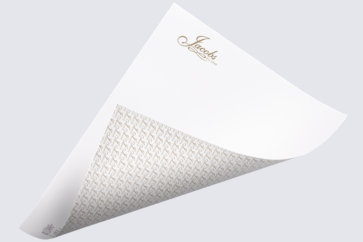
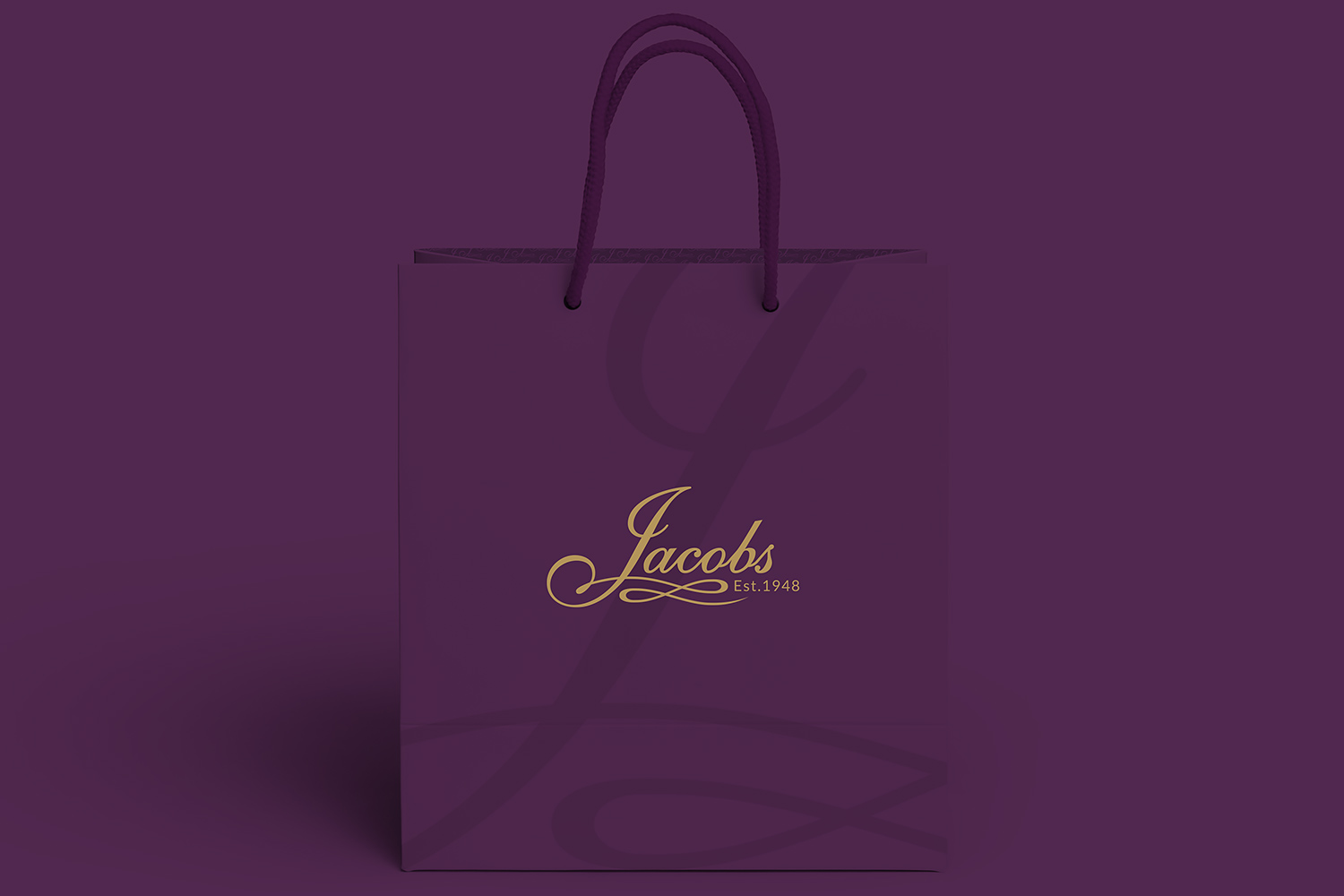
Our new brand is an evolution of Jacob’s established identity: the logo colourways have been simplified and a refined sans serif typeface introduced to the wordmark and across materials, expressing the brand’s heritage with elegance and restraint. The branding palette now includes the J watermark and a monogram repeat pattern crafted for use across printed items, packaging and website. Marketing and brand guidelines have been updated and expanded.
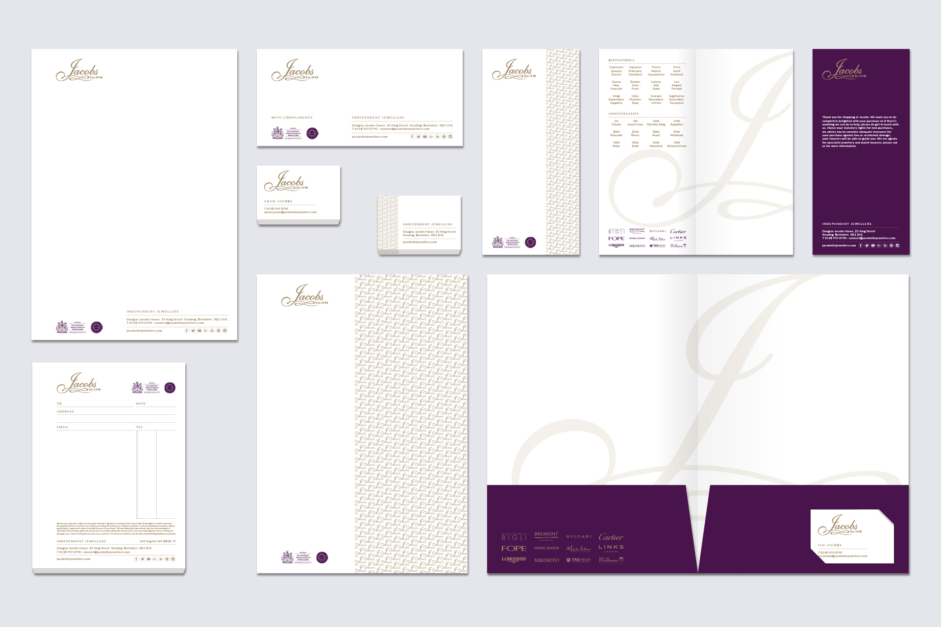
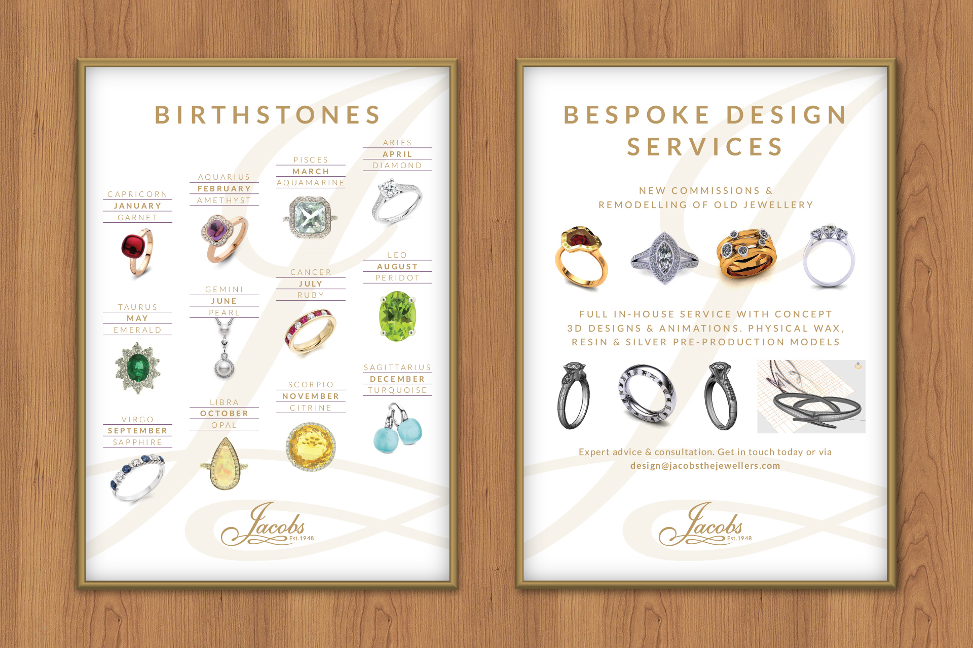
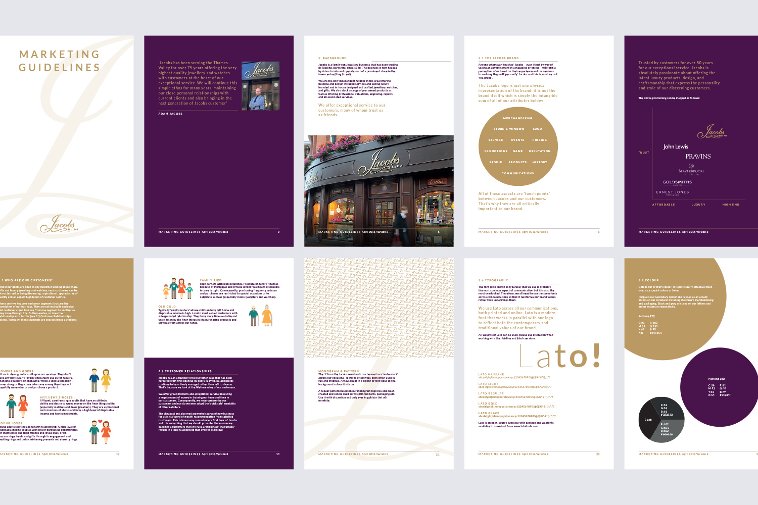

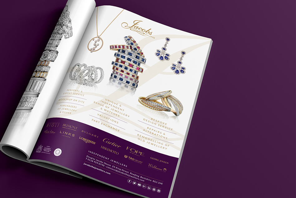
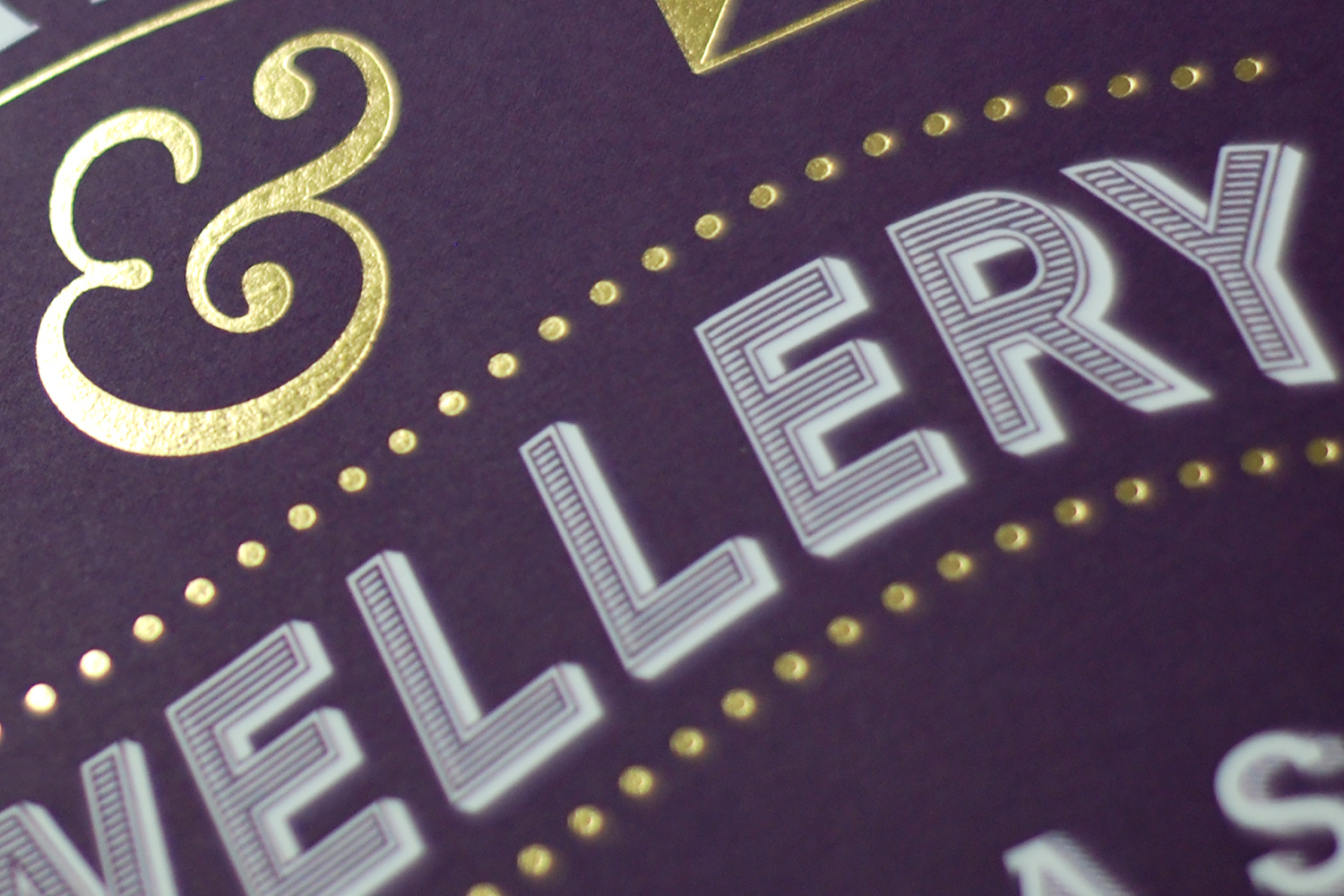
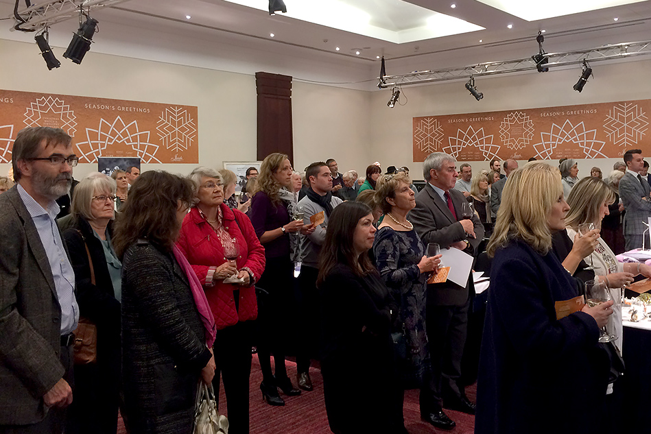
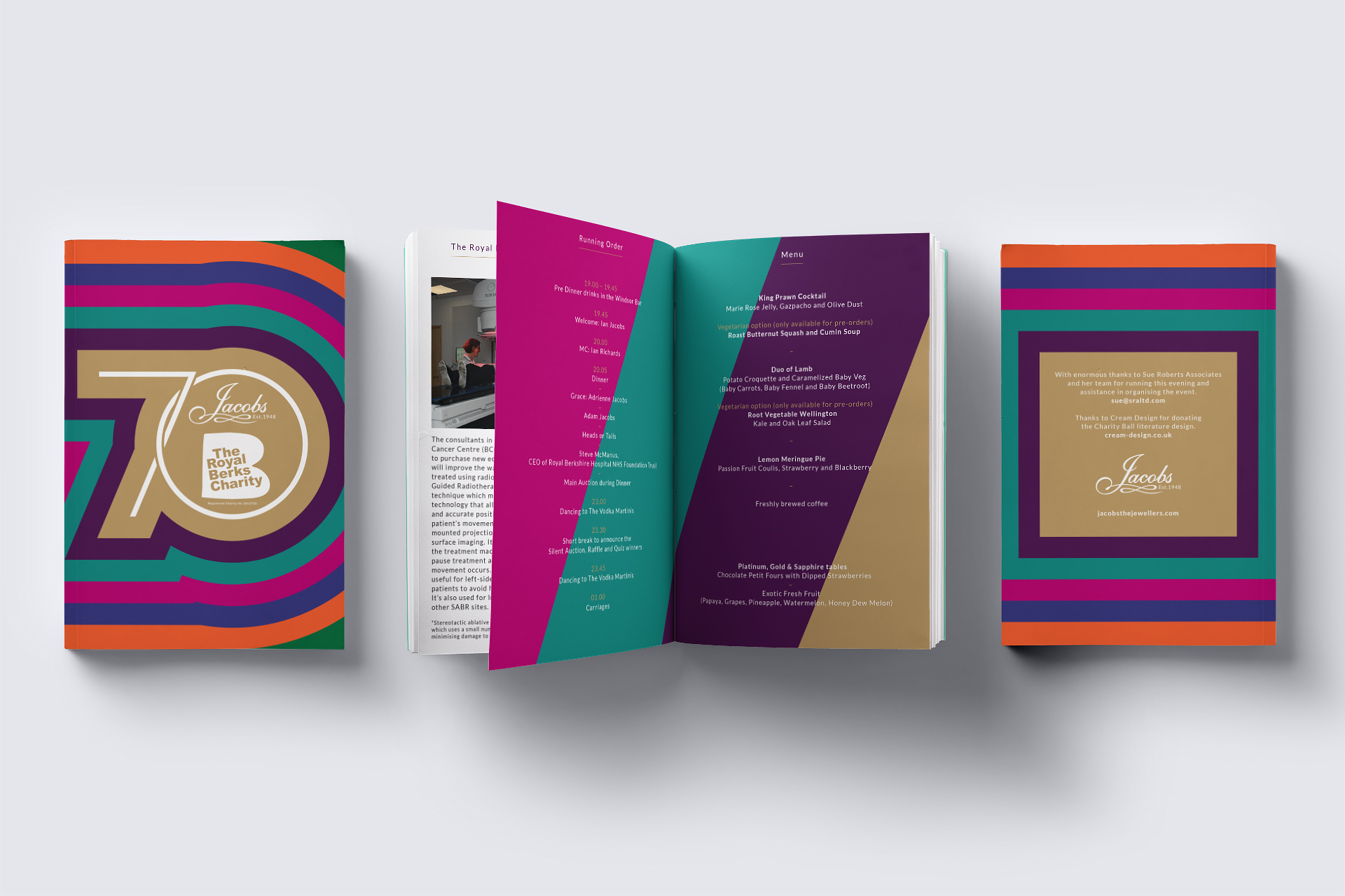
Across key seasonal marketing collateral, the new refined identity is embellished and, at times, contrasted with bold typography, imagery and colour palettes. From luxurious print finishes and bespoke personalisation, to impactful MailChimp assets and supersize exhibition and shop graphics, consumer engagement is maximised.
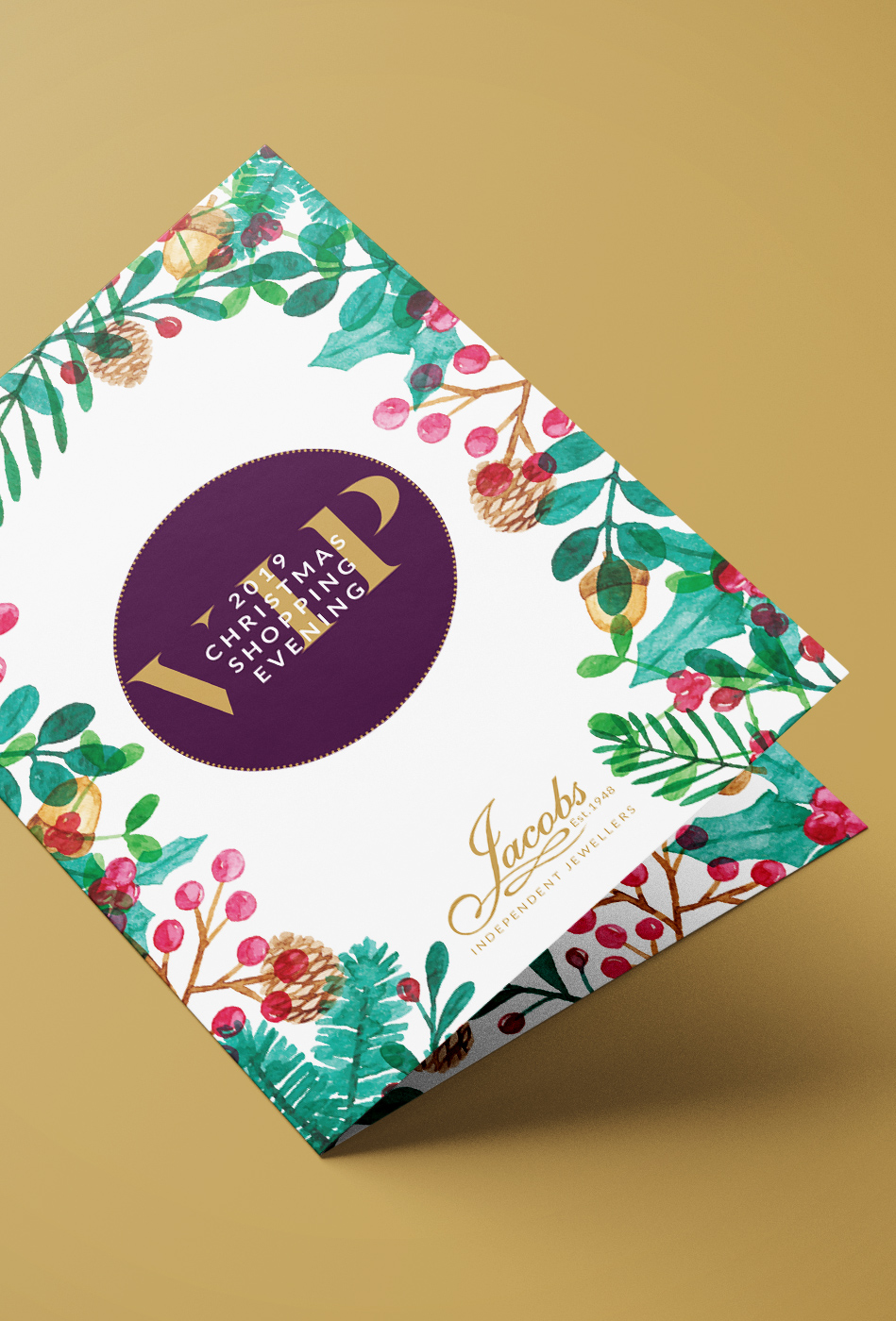
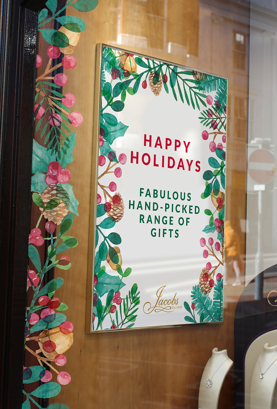
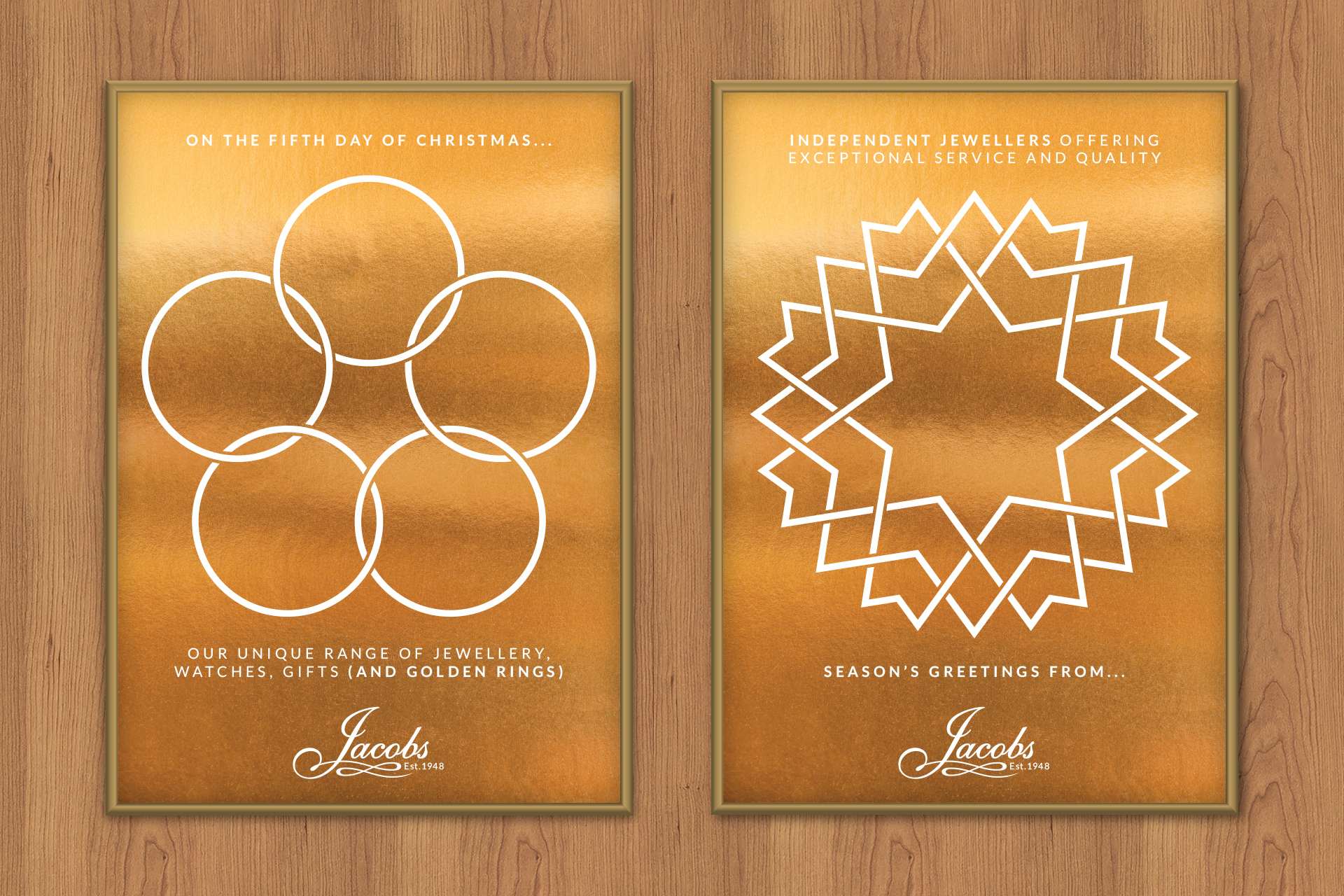
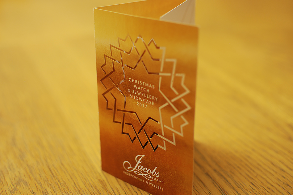
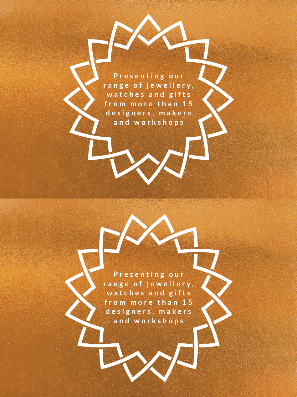
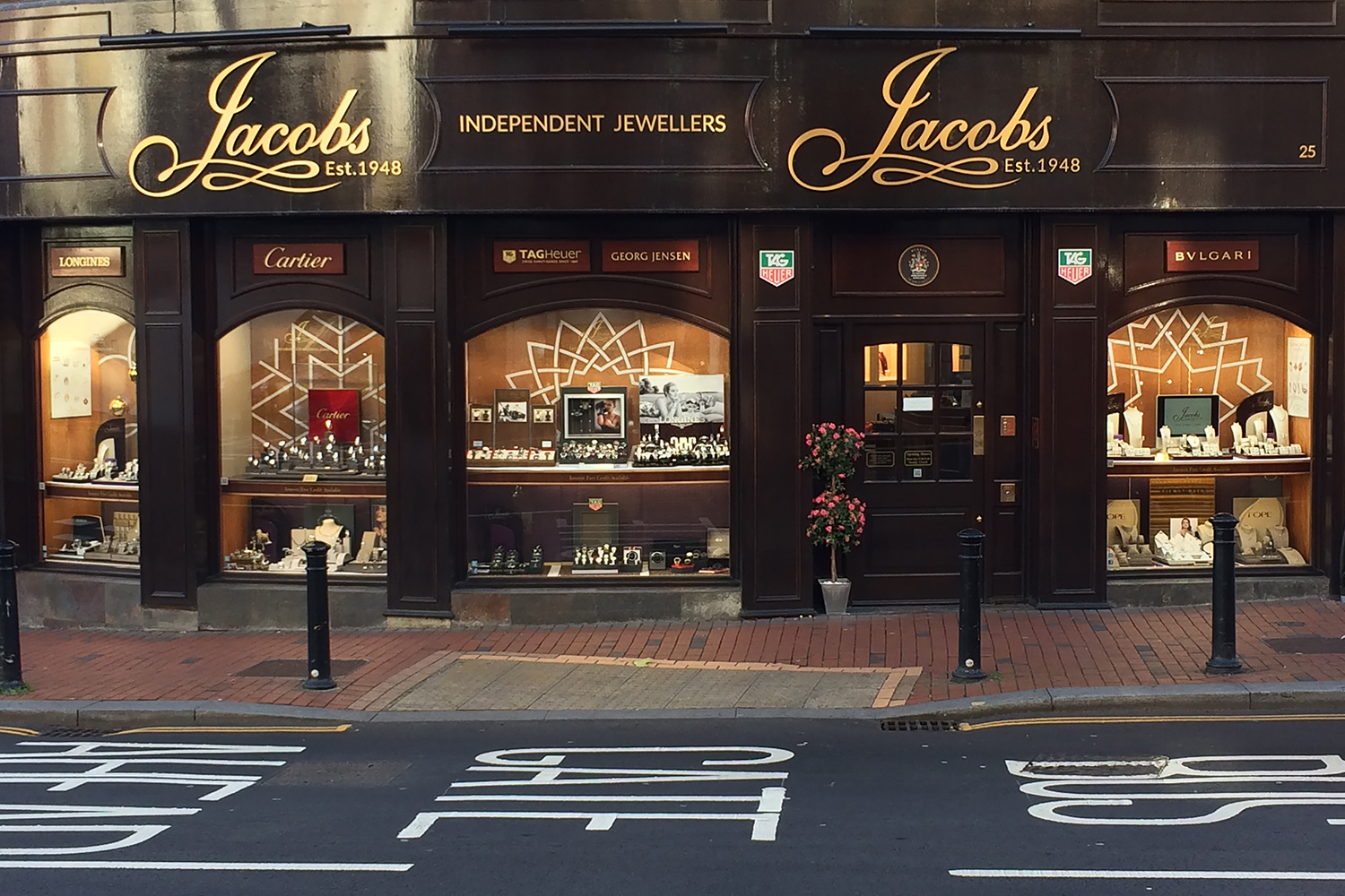

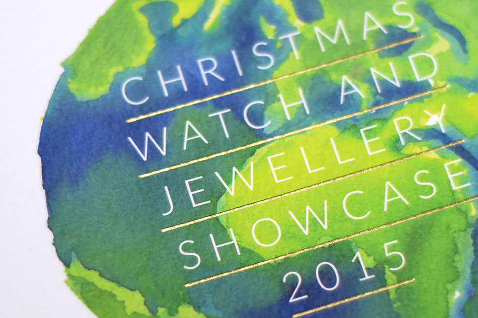
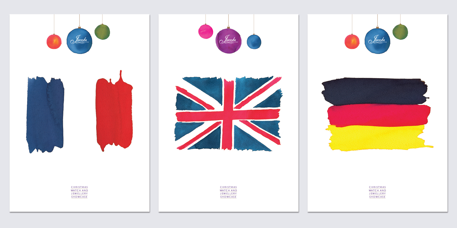
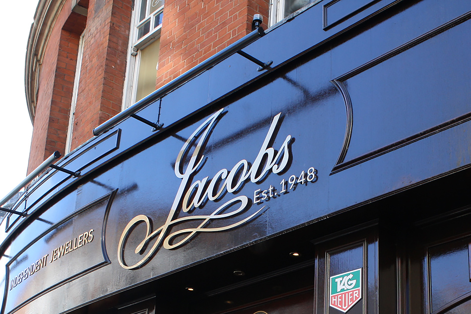
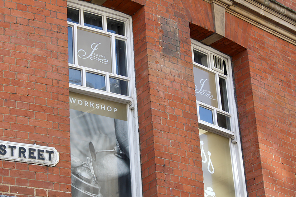
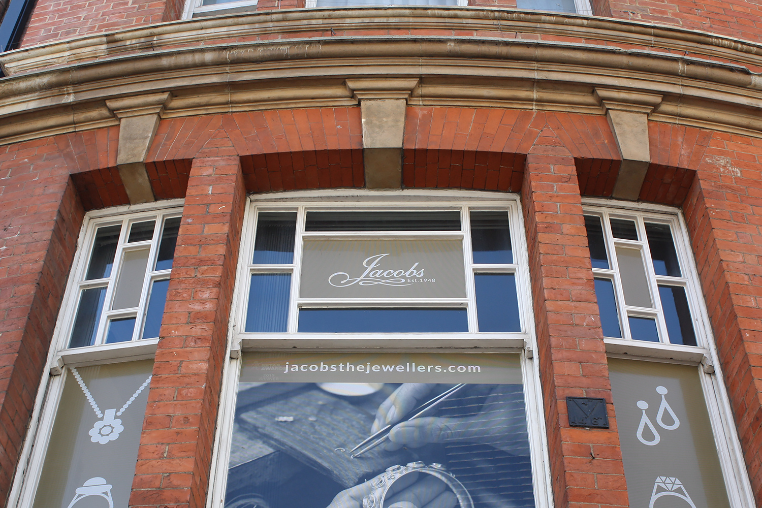
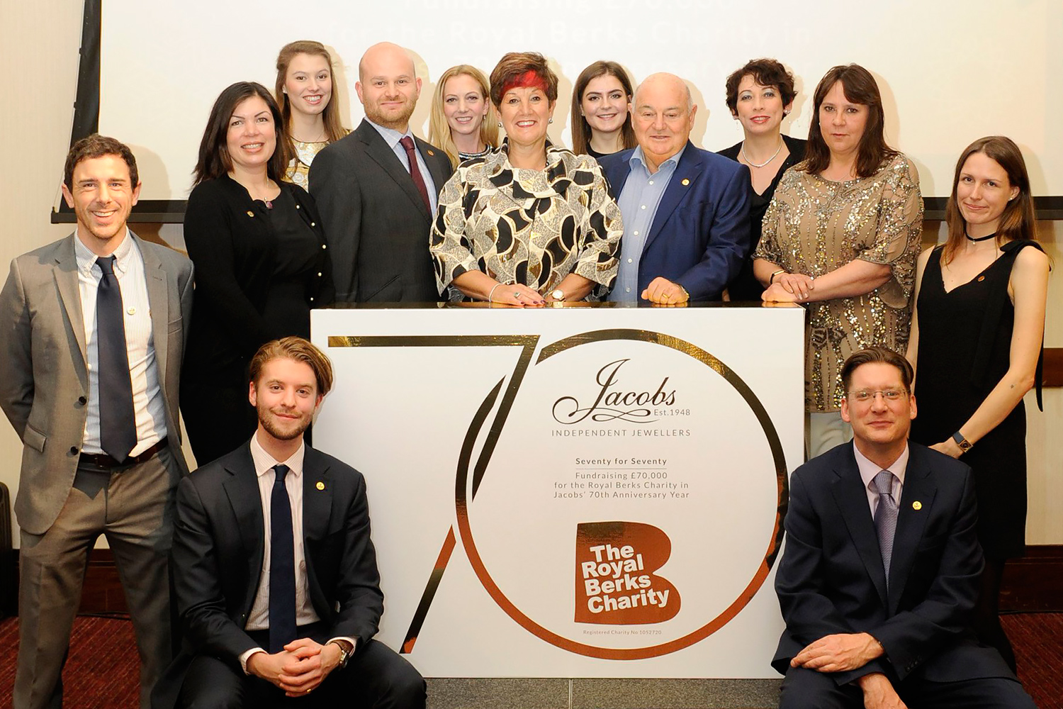
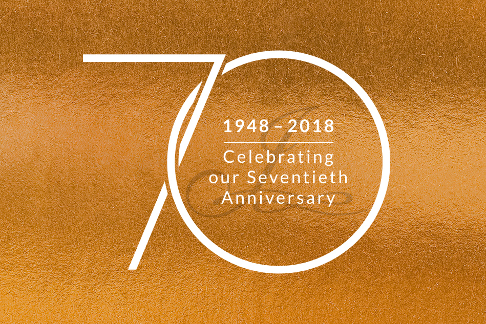
As well as their Christmas exhibition and shop graphics, we’ve expanded brand messaging to the first-floor of the Jacob’s town centre store using Contra Vision, and produced bespoke raffle boxes to tie in with our logo for their 70th anniversary celebration and fundraising initiative.

‘We’ve been working with Cream for around 5 years and find them friendly, helpful, reliable, creative and easy to work with, delivering great results. We’re a small independent business and communicating effectively is essential.’
Adam Jacobs, Director