Does good design do your business any good? We think so. It’s less showing off, more showing what you can do. Designing with clarity for engagement and impact. Improving your bottom line. Creating simple, powerful branding, print and digital that speaks to all kinds of people, for all kinds of clients.


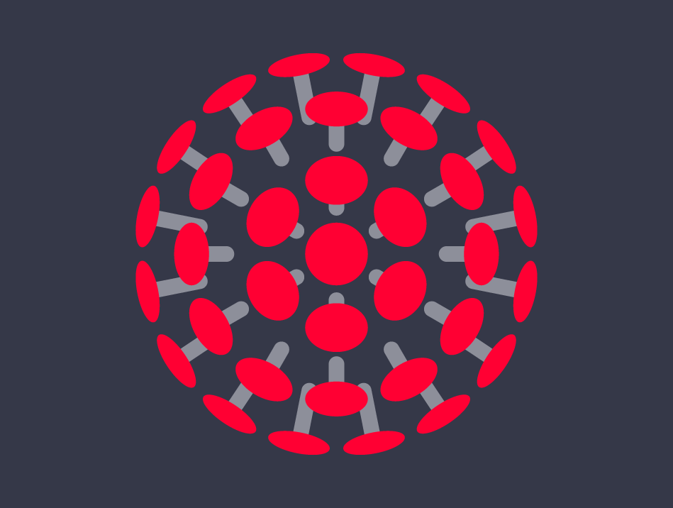
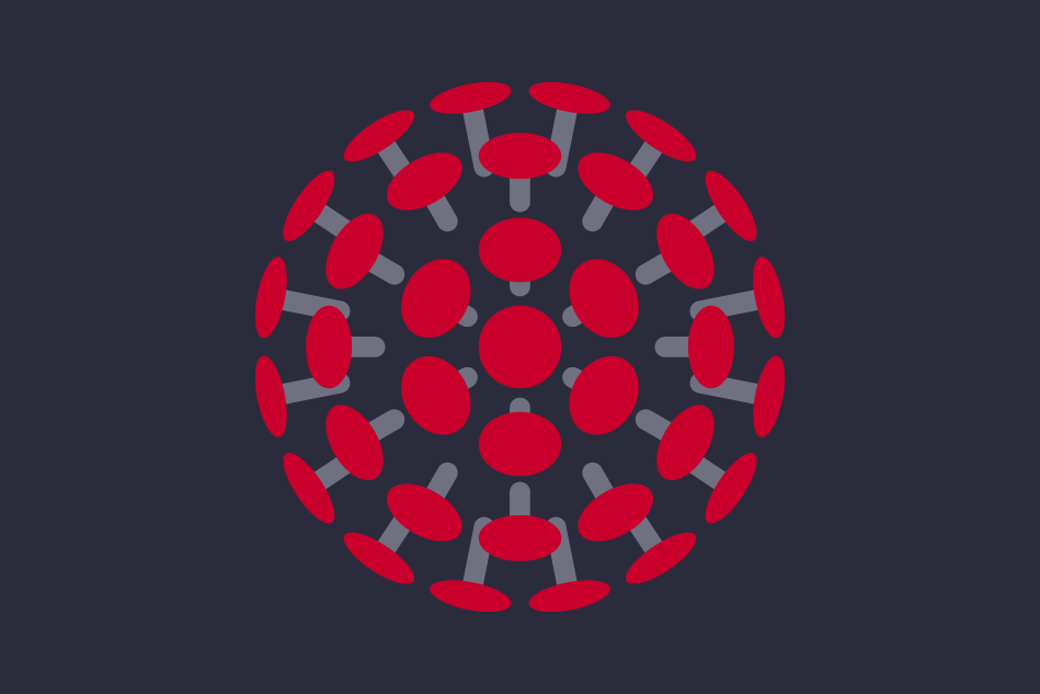
Intelligent Health
Creating a vibrant brand for an active organisation
Brand identity & logo design / illustration / literature / website design
heart
We’re perfectly placed in the centre of Reading, just a 5 minute walk from the station. Our small but perfectly formed brand agency crafts design that speaks for itself.


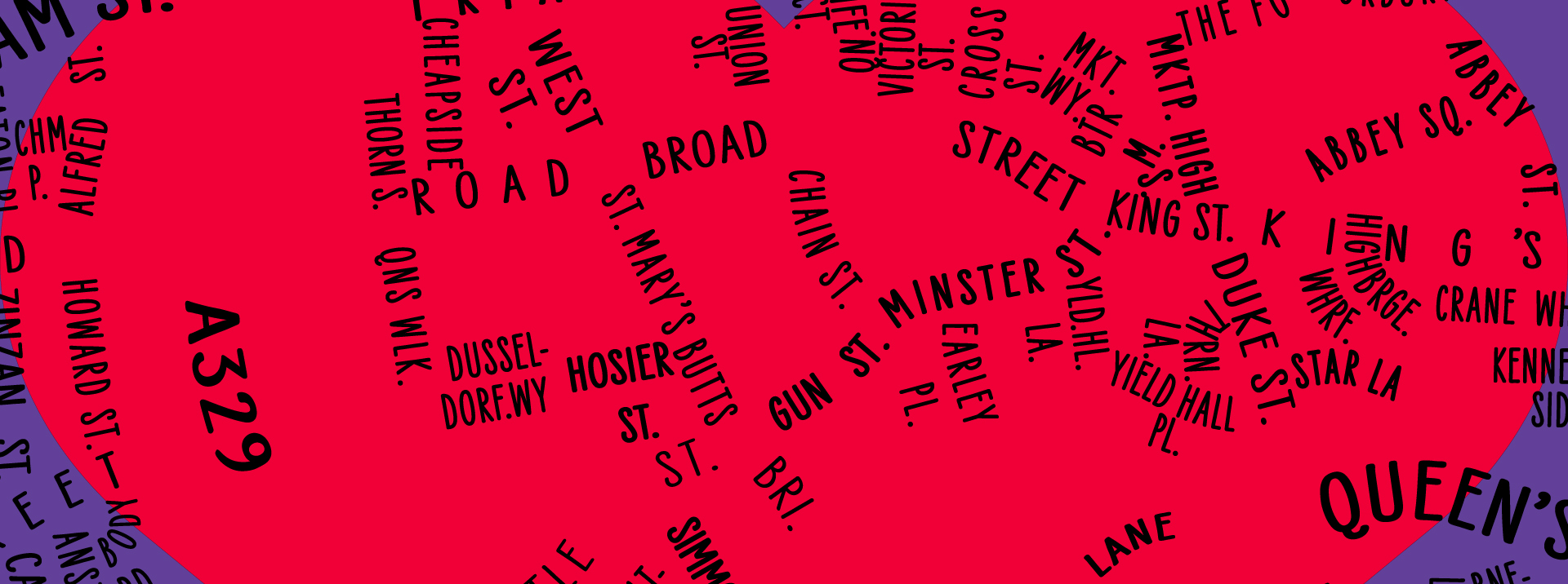
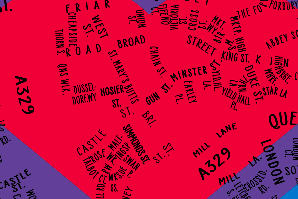
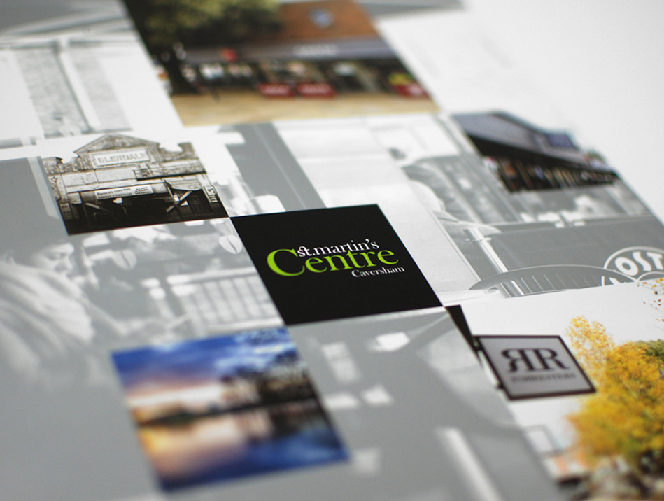
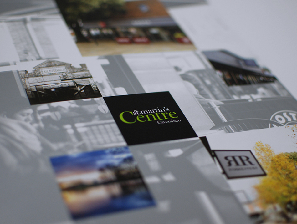
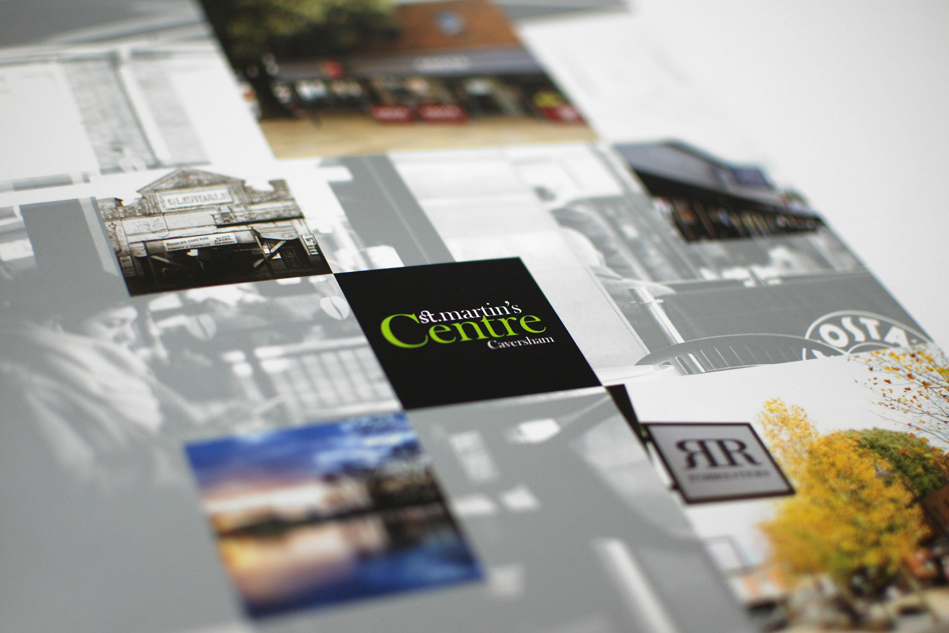
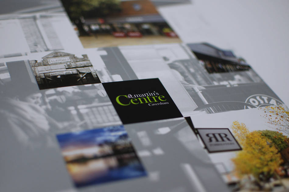
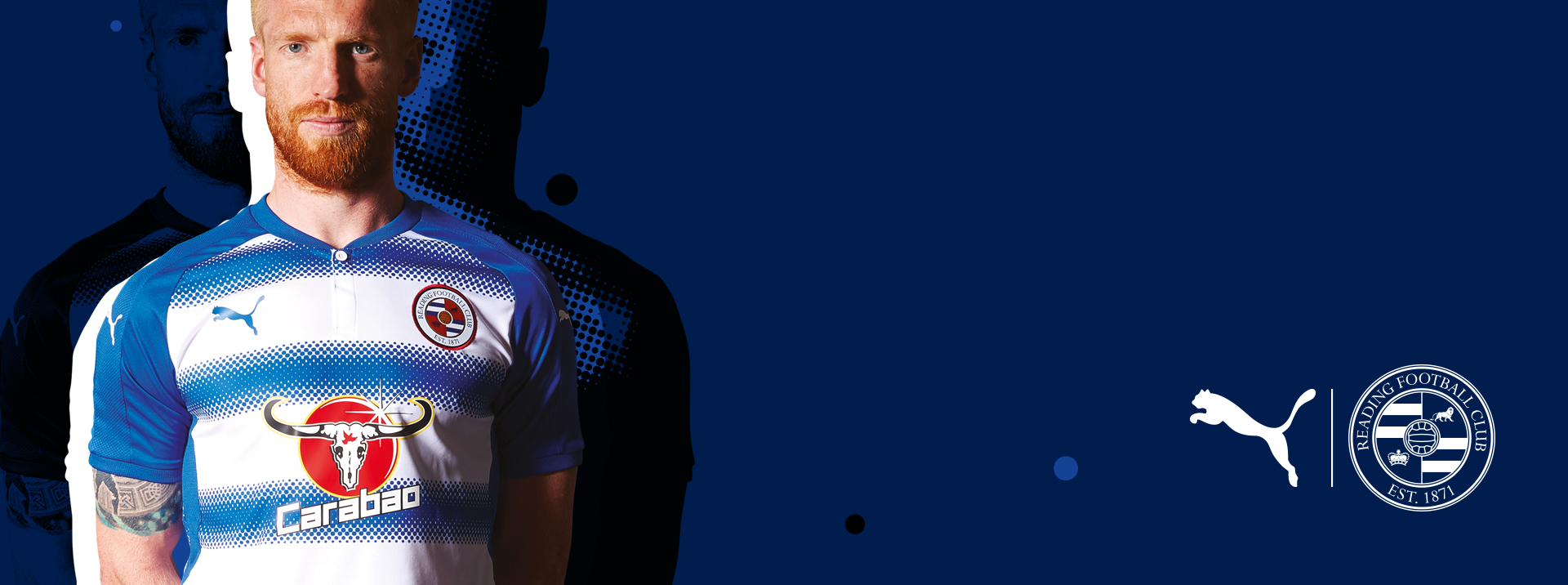
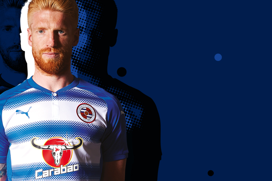
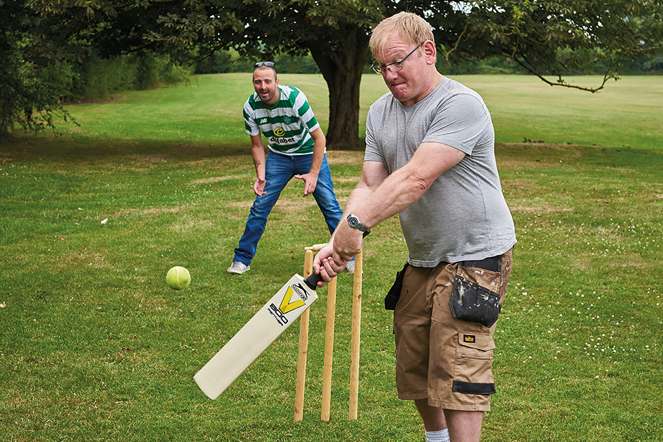
Pride of Reading
Presenting a new face for an inspiring awards event
Brand identity & logo design / literature & marketing / architectural graphics
score
We’ve combined expertise and experience to deliver bright ideas since day one. More than 20 years on, we create identities, marketing collateral and websites for all sorts of clients.
Jacobs
Adding sparkle to an award-winning jeweller
Brand identity & guidelines / literature & marketing


Launchpad
Opening doors for a homeless charity
Strategy & naming / brand identity & guidelines / website & literature